Saturday, December 31, 2011

Target audience's reaction

title="Wordle: Magazine review"> src="http://www.wordle.net/thumb/wrdl/4643565/Magazine_review"
alt="Wordle: Magazine review"
style="padding:4px;border:1px solid #ddd">


I have asked a few different people to come up with the adjectives they would use to describe my finished magazine and made them into a Wordle. I am quite pleased with the reaction to it, as a few people have described it using words like "modern", "young" and "striking, which is what I was aiming for when creating it. It also shows that it will appeal to the target audience, as words such as "youthful" and "teenage" have been used. I am also pleased with the reaction to the actual contents of the magazine such as the double page spread, which has been described as "contemporary", "independent", "targeted", "interesting", "topical" and "informative", which are more or less exactly the sort of words I would use to describe the genre and contents of it.

6. Looking back at your preliminary task, what do you feel you have learnt in the progression from it to the full product?

5. What have you learnt about the use of technologies from the process of constructing this product?

Since entering my magazine to be re-submitted I have started work on my A2 coursework, which has demanded different Photoshop skills and knowledge to what I previously used to construct my initial magazine. Primarily, I have learnt through experience that it is extremely important to do basic things like naming layers; going back to my AS magazine was tricky at first, as none of the layers were labelled, so everything was very difficult to access. Furthermore, the amount of layers I had didn’t reflect the amount that I was actually using; nearly half of the layers for my front cover, contents page and double page spread were hidden and were no longer in use, and should have been deleted. Although it seems very obvious, tidying up my layers palette made constructing my magazine a lot easier. Another thing that I have learnt since re-entering my coursework is that if I needed to manipulate several layers at a time, I shouldn’t merge them (unless necessary), but I should put them into groups. I was forced to completely restart on several of the layers that I had previously merged, as I was now unable to access or manipulate the individual layers that they were made up of. Grouping layers has made the process much simpler, and, although it can take longer if there are several layers that need to be grouped, it still allows the freedom to move and edit layers individually or as a group. This has been invaluable when creating things like the white text in the red boxes on my front cover; if I wanted to make the text smaller, or increase the size of the box to fit around the text better, I was able to do it without a problem. Something which I have used much more this time round is the ‘Magic Wand Tool’. Before I had relied a lot more on the ‘Lasso Tool’ and the ‘Magnetic Lasso Tool’, which, although sometimes necessary, took a lot longer and didn’t give results as professional-looking as I wanted, as edges weren’t as refined. I hadn’t really used tools such as the ‘Magic Wand Tool’ very much when I first submitted my coursework, and it was only when I decided to resubmit it that I researched and attempted to follow Photoshop tutorials a lot more thoroughly. This gave me a much better grasp of basic Photoshop skills, and also introduced me to tools such as the ‘Magic Wand Tool’ (which was invaluable when copying and pasting fonts off www.dafont.com in order to get rid of the white background) and the ‘gradient tool’, which I used on my front cover. The tutorials I referenced when making the album cover to go on my double page spread were extremely useful and interesting in terms of my knowledge of Photoshop; I had never before used the ‘Match Colour Tool’ or the ‘Convert to Smart Object’ option, and, although I will need more practise at using these things before I understand them completely, I am much more aware of how different functions of Photoshop work. Furthermore, although at first I did not always completely understand the tutorials (such as not knowing what a tool was, where to access it etc.), with practise I can now work my way around Photoshop much more quickly, and can remember where to find most of the tools I use and which come under each options list (for example, I know that under ‘Filter’ I can access options such as ‘Liquify’, adjust the Noise or add a Blur, among many other things). As well as Photoshop I have used the website www.picnik.com to adjust the brightness, exposure, saturation etc. of the images I used in the contents page, so as to improve the look of them. This was a useful website to edit the images beforehand in a quick and easy way, so that I could then put them directly onto my contents page in their edited forms instead of having to go through lots of different options on Photoshop to see what looked best.
Another thing that I have learnt in terms of planning, is to create in advance all of the initial blog posts that I know I'll need to write; this way, I have a clear list of the initial posts that I will write, which, although I can add to it at a later date, really helps with the organisation of my posts.

4. Who would be the audience for your media product? How did you address/attract your audience?

Contrary to my initial magazine, I feel that with the strong focus on indie style and music in my resubmitted magazine, as well as the layout of it, it would appeal much more to a younger audience ranging from mid-teens to late twenties, instead of simply being a music magazine for a broad age range of people who were interested in up and coming music. This therefore means that, as the target audience is smaller, I was able to address and appeal to it more by giving my double page spread interview a less serious tone, which is the norm in interviews in NME Magazine. The light tone makes the interview easier to read, as well as being amusing and appealing to a youthful audience. However, I have tried to balance it out by addressing more serious issues such as illegally downloading music; this is a very current and talked about issue, which is frequently debated over by bands and music lovers. Including this in my interview will appeal to my target audience, who will be interested to know my double page spread artist’s opinion on the issue, as well as giving them more information about it. The fact that many artists don’t earn a lot of money is something that I was made aware of through reading a lot of music magazines myself, and something that artists tend to address; recognising this in my double page spread interview makes the target audience aware of this, which might encourage them not to download music illegally in order to support the artists whose music they listen to.
Furthermore, the bright colours and fun, quirkiness of my magazine (such as the props used in the photoshoot and the answers in the interview) give off a very youthful vibe, and might be thought of as too young for an older audience.

3. What kind of media institute might distribute your product and why?

One institute that might distribute my product is IPC Media, which I have done a research post on here. IPC Media is a firmly established and successful distributor, and it's conglomerate company IPC Inspire already distributes NME, which has been massively successful. However, as IPC Inspire is targeted towards men, and IPC Media doesn't have a conglomerate company that distributes magazines targeted towards both men and women, it may not be the best choice to distribute my magazine as it doesn't have a niche for it to be marketed in. Furthermore, if it was distributed under IPC Inspire, it would have major competition with NME, as both magazines have a similar genre and target audience. An alternative distribution company that could distribute my magazine is Bauer Media Group, which I have done a research post on here; although it is a German company, it distributes magazines in 15 other countries including the UK. Although it does already distribute the music magazines Q and Kerrang!, does have a niche for a magazine like mine, aimed at people in their teens to late twenties who want to find out about all new up and coming bands, as well as popular indie music. While Q is aimed at older readers wanting to read about music, Kerrang! focuses on rock music; as my magazine has a different audience and genre to both of these, it would stand out and target the audience that neither Q or Kerrang! reach. I therefore think that Bauer Media Group would be an ideal distributor for my magazine.

2. How does the media product represent different social groups?

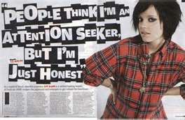
I think that my product represents the young, indie music scene well, using typewriter style fonts that fit in well with the vintage style that is extremely popular among ‘indie’ youth, as well as addressing music genres and artists (for example Best Coast) associated with indie music. Furthermore, the way I have styled and dressed both my front cover/double page spread artist and the artist on my contents page is inspired by clothes typically associated with indie style, such as the skinny jeans and denim blouse in the photo of my contents page artist. Furthermore, the props, such as the apples, are quirky, original and similar to props commonly seen in NME and Q magazines to add interest and humour to the images (such as the one below, which features an ice-cream).


I think the image I have used for my double page spread emulates this style well, whilst fitting in with the colour scheme and appearing eye-catching. Furthermore, I think I have also addressed the indie social group through the issues I have addressed in my double page spread interview, such as mentioning illegal downloading, musical inspiration and future tours. The small article on an up and coming artist in the contents page also takes inspiration from NME, another indie magazine, which features articles like mine in the contents page. This helps to attract an audience interested in indie music, as they would be interested to know about the artist. Overall, I think I have represented the indie music social group fairly well, as I have taken inspiration from other indie magazines as much as possible.

1. In what way does your product use, develop and challenge forms and conventions of real media products?

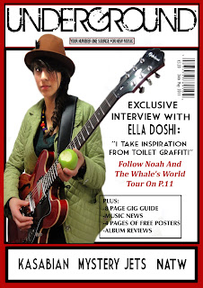
I think that now my final product has been changed and improved, it uses and develops forms and conventions of real media products rather than challenging them. Having taken particular inspiration from Q and NME magazines for the aesthetic elements of my magazine, and from NME magazine for the content, I feel that I have achieved a magazine that follows conventions, yet stands out because of its particular emphasis on up-and-coming artists. Primarily, the red, white and black colour scheme of the front cover and contents page helps them to stand out, and takes inspiration from the colour scheme of Q magazine. Furthermore, the fact the I have colour co-ordinated the fonts on the front cover with the cover image, tying in with the pale green of the artist’s coat and the red of her guitar, shows that I have used the conventions of typical magazines such as NME. Another thing that uses and develops forms and conventions of magazines such as NME and Kerrang! is the small article on the contents page about an up-and-coming artist to look out for. Small articles or reviews on contents pages are common in these magazines, and help to make the contents page more interesting whilst keeping the reader's attention. I think my contents page in general is quite similar to the contents pages in Q and NME magazines, as it is streamlined and following a black, red and white colour scheme, as well as following conventions such as having photos with page numbers of some of the artists featured inside. I have also tried to emulate the style of the contents column in NME, by having the artists' names in bold capitals to draw attention to them, and having a smaller short description below. I have developed these forms and conventions by attempting to emulate the original and artistic style of double-page spreads in indie magazines such as NME, through my use of unusual props such as apples, and the smudging of the page border in order to make it look like it has been painted on, to match the quirky nature of the double-page spread artist. This method of adapting the mise-en-scene, fonts and layout to fit in with the genre of the magazine and the double page spread artist is very effective, as the respresentation created by the "arty," creative style of the double page spread ties in well with the fact that I have mentioned "Ella Doshi" is original and creative in the article itself. The green and brown colour scheme of it also connotes nature, which emphasizes the quirky personality of the double page spread artist. The use of several different eye-catching fonts is also conventional, and is very aesthetically pleasing. However, I have tried not to challenge forms and conventions, by ensuring that the size and proportion of all of the fonts is exactly right, so that the page doesn't look cluttered. Overall, I think I have used and developed forms and conventions of real media products well in order to make my own magazine look as conventional and professional as possible.

Changes to double page spread

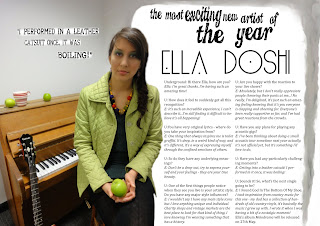
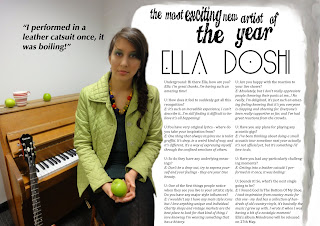
Here is my double page spread with the new introduction and interview:


I think it looks a lot more professional than before, as it abides by the typical size 8 font used by most magazines. However, as there is still a space at the bottom, I have decided to add the dates that the artist is touring, which appears to be quite common at the bottom of existing double page spreads:


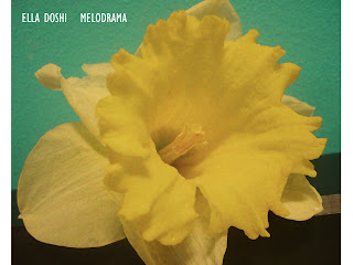
I have also added an album cover, so that readers would be able to recognise the album easily in adverts or shops:

Making the album cover

I initially gave my image a retro look with the help of this tutorial:
http://photoshoptutorials.ws/photoshop-tutorials/photo-effects/retro-colors.html
Firstly, I opened up the photo in Photoshop and then created a new layer. With the new layer selected I then used the Rectangular Marquee tool to create a box around the left hand side of the image. I then chose a red colour from the swatches pallet and used the keyboard shortcut Alt+Backspace to fill the box with red. I then inversed the selection so that the right hand side of the photo was selected, and this time filled it with green. Next, I hid the layer and went back onto the background layer and selected the Match Colour tool. In the image statistics box that came up, I entered the image’s document name as the source, and Layer 1 as the layer. Next, in image options, I increased the fade and decreased the colour intensity of the image.
This was the result:


I then added film grain to my image, with the help of this tutorial:
http://photoshoptutorials.ws/photoshop-tutorials/photo-effects/natural-film-grain.html
Firstly, I opened up my new retro-colours image in Photoshop. I then created a new layer and filled it with 50% grey, and changed the blending mode of the layer to “Overlay”. Next, I right clicked on the layer and selected “Convert to Smart Object”. I then clicked on “Filter” and then on “Add Noise”, the amount of which I adjusted to 400%.I then added a “Gaussian Blur” over the top of this by going on “Filter”, “Blur” and then “Gaussian Blur”. I then adjusted the opacity of the layer so that the grain did not appear too strong. I then added the artist and album name in a font off www.dafont.com.

This is the final image:

Photos for album cover

Changes made to my contents page

The first changes I made to my contents page was to get rid of the border around the contents column so as to make it look less 'boxy'. Then, taking inspiration from the NME's contents columns, I put all of the band and artist names in bold capitals to make them stand out. I then moved them next to the page numbers and put a short description of the article in smaller letters. I also changed the font, as I wasn't happy with the previous one, and added more articles, as there definitely weren't enough in relation to the cost of the magazine - considering that NME is only £2.20 it tends to be over 60 pages long. I also changed the names of the categories to a red font, and filled the boxes they were in with black.


I then changed the size and positioning of the images and wrote the page numbers in black in the same font as the writing in the contents column, and put them in white boxes. I also got rid of the strip of red along the top, and replaced it with a red and black strip that I made using the 'stroke' tool. This was a lot more aesthetically pleasing and professional-looking than what it looked like originally:


I then added the article I wrote, as well as a the photo to go with it, and the article heading "Look Out For" which I wrote in a font from www.dafont.com. I then added a picture of an arrow to the end of it, which filled up some space and was aesthetically pleasing:


Finally, I added a new subscription box. The only changes I made to the text was to match the font with the rest of the page, make it white and make the website's name shorter, but I filled the box it was in with black and gave it a red border with the stroke tool. This colour scheme made it stand out more and look more conventional. Here is my final contents page:

Article for contents page

Here is an article I've written after researching and finding out that quite a lot of music magazines have small articles (such as reviews or reccomendations of new artists) in their contents pages. I have tried to emulate the writing style and descriptions generally used when talking about the indie/acoustic genre. I also wanted to reference a record label that a similar artist was signed to, as a lot of the time record labels tend to preference a certain genre of music; as Laura Marling is of a similar genre to the artist I have invented here, I chose the record label she was signed to. The "free download" is common in most music magazines, and is a reference to the synergy and convergence in the magazine industry.

The article:

Mon Amie, the stage name for Stephanie Reagen, a songwriter from Twickenham who combines acoustic melodies with raw, haunting vocals. Currently signed to WayOutWest Records, the same record company that brought Laura Marling into the public eye, Mon Amie is hoping to release an E.P in the new year. Songs to listen to are “Spoken” and “You Walked”.
FREE DOWNLOAD OF “CARPET” ON WWW.UDGMAGAZINE.COM

I also included this image of the 'artist':


I got my sister to model for me, and took it with a digital camera. I then adjusted the brightness and exposure on Windows Photo Viewer. The way she is dressed, in particular the skinny jeans, is a style typically associated with indie artists.

Ideas for an album cover

As an addition to my double page spread I think it would be a good idea to add a photo of the album that the artist was releasing. To complement the answers I wrote in the interview, I've decided to create a vintage or retro looking album cover (as this is the style of the artist) featuring some form of flower, to tie in with the fact that she has named a lot of her songs after flowers. Here are a few recce shots that I could use:

New and improved interview

Here is the extended interview. Before writing it I did more research into existing interviews in music magazines such as NME; the prominent casual tone that I found in nearly all of them is something I have tried to emulate as much as possible in my own interview, whilst trying to get across the singer's personality. The introductory paragraph at the beginning was something I thought of when noticing that all of the interviews I was looking at for research included some form of introduction, whether it be meeting the band or information about the artist. Most of the ones I looked at in NME were extremlely casual and tended to be about meeting the band or artist and, at times, describing their mood, so it was this type of introduction that I decided to write:

Talking to Ella Doshi is like a breath of fresh air to my day; after simply exchanging hellos and pleasantries, I have almost forgotten my splitting headache, or the fact that I will soon have to sit on the cramped, sweaty tube for an hour and a half to get home. The singer seems to radiate hyperactivity and happiness, which is almost catching. Perched on a precarious-looking bar stool, she chats away as though she has known me for years, something which is incredibly refreshing for an interviewer like me who has gone through countless painful interviews with fame-sick singers who remain uninterested and subject to much ‘editing-through-artistic-licence’.

Underground: Hi there Ella, how are you?
Ella: I’m great thanks; I’m having such an amazing time!
U: How does it feel to suddenly have all this recognition?
E: It’s such an incredible experience, I can’t describe it…I’m still finding it difficult to believe it’s all happening!
U: You have very original lyrics – where do you take your inspiration from?
E: One thing that always inspires me is toilet graffiti. It can be deep, in a weird kind of way, and it’s different – a way of expressing yourself through the confined emotions of others.
U: So do they have any underlying meanings?
E: Don’t be a drop-out, try to express yourself and what you’re feeling and you could make something really beautiful.
U: A lot of your songs are named after flowers. What’s behind that? E: It’s basically because of my grandad’s garden, which is where I spent most of my time when I was writing the album. I just loved the feeling of being so surrounded by nature, so I named my songs after each of the flowers that he’d planted because I was there for so long that now each flower represents all of the different emotions running through my songs.
U: One of the first things people notice about you live is your artistic style. Do you have any major style influences?
E: I wouldn’t say I have any major style icons but I love anything unique and individual. Charity shops and vintage markets are the best places for that sort of thing. I love knowing I’m wearing something that has a history.
U: If you could meet any three people who would they be?
E: Probably Noel Gallagher, Johnny Depp and Jamie Oliver.
U: Is there any musician you would like to collaborate with?
E: I’d absolutely love to do something with Mumford & Sons, I’m a massive fan of theirs and I’m just so inspired by their music.
U: Are you happy with the reaction to your live shows?
E: Absolutely, but I don’t really appreciate people throwing their pants at me…! No really, I’m delighted, it’s just such an amazing feeling knowing it’s you people are clapping and cheering for. Everyone’s been really supportive so far and I’ve had a great reaction from the crowds.
U: How do you feel about winning best new artist of 2011?
E: I’m over the moon, it was just so unexpected! I’m just so grateful for all the support my fans have given me, I couldn’t have got here without them.
U: Have you any plans for any acoustic gigs?
E: I’ve been thinking about doing a small acoustic tour sometime next year actually, it’s not official yet but, it’s something I’d love to do.
U: Have you had any particularly challenging moments?
E: Getting into a leather catsuit! I performed in it once, it was boiling!
U: Sounds it! So, what’s the next single going to be?
E: I Found Love In The Bottom Of My Shoe. I took inspiration from country music for this one – my dad has a collection of hundreds of old country vinyls, it’s basically the music I grew up listening to.
U: If you could spend the evening with three musicians, dead or alive, who would they be?
E: Laura Marling, Johnny Cash and David Bowie. I’ve met Laura before she’s so down to earth and we just get on so well, but she also makes such beautiful music and I incredibly admire the originality of her lyrics – she’s an inspiration. Johnny Cash is obviously due to my recent fetish with country music, plus I think he’s an absolute legend with a fascinating background.
U: And David Bowie...?
E: Haha! I was trying to avoid this, but I’m just completely obsessed with him! I used to be in an electro-rock band when I was about 15, I even dressed like him which is pretty embarrassing looking back…
U: Yes, um, I’m, trying to picture that image… I’ve forgotten what my next question was now.
E: Sorry…
U: Never mind. Ever thought of making a Bowie tribute album then?
E: Haha well I think I’ll have to now!
U: Well good luck with that! I’ve remembered what my next question was now. Would you like to hear it?
E: Go for it!
U: What are your opinions on all the music downloading and file sharing that’s going on? Are you for it or completely against it?
E: I wouldn’t say I was against it exactly, because sites like Limewire can really help launch an unsigned artist’s career, but then at the same time they can really damage it. Speaking from my own experiences, I know that if people hadn’t been buying my E.Ps I would have been dropped from my record company, you know, I wouldn’t even be here right now, being interviewed. I’m not going to act like we don’t all do it, because I do from time to time, and it just is more practical sometimes, but I think a healthy balance of file sharing and actually buying music off iTunes or as an album wouldn’t go amiss for some people. It’s a common mistake for people to think that just because an artist is in the music industry and has a record deal they’re making loads of money – it’s just not true for the vast majority. And I don’t know about anyone else, but I would rather have an actual album up on my shelf that just a bunch of files on a computer. It’s more sentimental.
U: Is there anything that’s really annoying you right now that you’d like to get off your chest?
E: Yes! My backing singers keep raiding my fridge. The other day they stole a whole Camembert!
U: Dear me.
E: I was pretty distraught!
U: I can imagine. Well, thank you Ella, it’s been a pleasure. Any last words?
E: Where’s the nearest McDonalds? I’m starving.

Ella’s debut album Melodrama will be released on 27th May with Rough Trade.
You can pre-order now on www.roughtrade.com/elladoshimelodrama

How I could improve my contents page


Here is the version of my contents page that I first submitted:


As with the front cover, I think this contents page has a bit too much white space and is too 'boxy'. Everything is also a bit too big and takes up too much space, whilst not enough information is given, and the page numbers at the sides of the photos are too big, in particular the red background they are on. On these contents pages, however, the photos are streamlined and considerably bigger than the photos on mine, helping to avoid the 'boxy' look:


The page numbers on the photos in this contents page are written in white boxes, which gives it a very streamlined look. There is also no "p." before the page number, and the font used is very small and simple:


I will try and base my contents page on the contents pages in Q and NME, taking inspiration from them to help make mine look more professional and conventional.

Changes made to my front cover


This is the front cover I initially submitted. I have made several changes to it, taking inspiration from the front covers I analysed in the powerpoint in a previous post.
To start off with, I needed to make the background look slightly less blank.


For this I took inspiration from the image above, and have tried to emulate the interesting lighting technique which creates a gradiated background. To do this I used the 'gradient tool', which I dragged across the background until I got the look I wanted.


I then adjusted the fonts; this involved changing the style, colour and size of the original fonts used. For the cover artist's name, I used the same font as I used on the double page spread, as all bands and artists have a particular style in which their name is written so that it can be easily recognised on, for example, festival posters such as this one:


The "ELLA DOSHI" font and the pull-quote font are taken from www.dafont.com. I also used the magic wand tool and the Shift+F1 shortcut to fill the pullquote with a red colour to match the guitar and border, and then stroked it with a black border to make it stand out.


I wasn't happy with the positioning of the fonts, however, and wanted to make them more colour co-ordinated with the cover image, so I moved the artist's name so that it was more central, and filled it with a red colour that matched the guitar and border. I then filled the pull-quote with a green colour that matched the cover artist's jacket. I also filled the blank space at the top with an advertisement for a competition in the magazine that is mentioned in the contents page.


I then created a 'puff', as, after research, they proved to be extremely common on magazine front covers. Mine advertises the bands that are featured in the magazine, so as to capture the target audience's attention and persuade them to buy the magazine.


Then, taking inspiration from the front cover below, I wrote information about the contents and features of the magazine in a white font inserted into red boxes so that it stands out:


I also changed the competition advert so that it was written in the same red boxes, as it stood out more and was much more appealing to the eye.


This is my final front cover, which I think I have improved greatly from the original one that I initially submitted; it is not as basic, with less blank spaces, more information, and it is much more appealing to the eye, as it includes a variety of fonts which are colour co-ordinated with the main image. The whole thing is therefore much more eye-catching, and I believe that it will appeal to my target audience more than the previous one, as more information about the actual contents is now included on the cover.

Powerpoint on how I could improve my front cover

Research into Bauer Media Group

Bauer Media Group is a German distribution company that distributes magazines in 15 countries globally, including the UK. It is run by and is privately owned by the Bauer family, and the worldwide circulation of its magazines is currently 38 million magazines per week. These magazines include:
-Bella
-Take A Break!
-TVChoice and Total TVGuide
However it is Bauer Media Group's music magazines (Q and Kerrang!) which have had the most success, resulting in them becoming Bauer Media Brands and synergising into radio, TV and music awards. Q magazine is aimed at an older audience of music lovers, which was previously an audience which had been overlooked by the music magazine industry. This was clever research into a gap in the market, something which I think I could reach with my magazine; as Bauer Media Group doesn't reach out to a younger audience of indie music lovers, I think that my magazine could fill this gap in the market well.

Thursday, December 15, 2011

Changes

I have decided that I am not entirely happy with my magazine in its current state, and have decided to resubmit it so as to make some further changes. Primarily, after doing some research, I think the font size of my double page spread interview is much too big; most magazine interviews are written in size 8 font, which is quite a contrast with the size 14 font I used for mine. However, now that I have changed it, my interview only takes up a small space on the page, so I will have to write considerably more.


Font size is small so as to fit more on the page - more appealing to the eye as there is more to read.

Another thing I am not happy with is my contents page; it feels a bit too 'boxy' with not enough information. Further research into existing contents pages shows that they tend to include editor's notes, which ususally give a brief, casual description of what to expect in this issue of the magazine, or a 'mini' article on, for example, a new artist, single or album, or a gig review.

Finally, my front cover has much too many blank spaces, which, although making it striking, make it look a bit too bare. I will do some further research into what I could add to my front cover, and I hope that making these changes will make my magazine look more professional and conventional.

Sunday, April 17, 2011

Final product and evaluation

Below are the pictures of my finished front cover, contents page and double page spread, and a prezi evaluating my final product:


Here is some of the feedback regarding my finished product:


Wednesday, March 30, 2011

Creating my double page spread

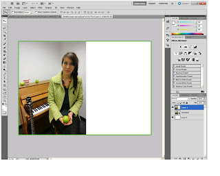
This was the image I started off with when making my double page spread:

I opened it up in an A3 Photoshop document and placed it over one half of the page. I then made a green border around the entire page using the "stroke" tool, so as to tie in with the green colour scheme of the photo, which gave this result:

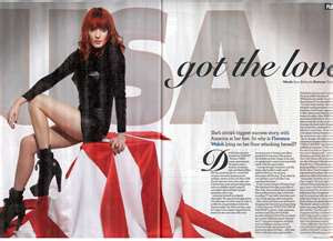
I wasn't happy with it, as the image looked detatched from the rest of the page, so I did some research into double page spreads and found that images on them usually tend to be cut out and layered onto a different background (such as the first image below) or are simply cut around so that they overlap onto the text side of the page (such as in the second image below:


In order to achieve this look myself, I got rid of the page border and used the "magnetic lasso" tool to cut around the edges on the right-hand side of the image:

I then smoothed the edges using the "blur" tool.
However, the contrast between the grey and white backgrounds still didn't look right, so, repeating an effect that I used for the contents page in my preliminary task, I used the "smudge" tool and the "colour mixer" tool to smudge the top of the grey background around the other half of the page, so that it resembled a kind of border made by a paintbrush. The artistic connotations this held fitted in well with the creative and original nature of the singer featured, which is accentuated by the interview I did (see previous post):

The next step was to insert the article itself; I put it into columns and highlighted the answers in italics so that it would more resemble an interview:

Next, I added headings (using fonts from www.dafont.com) and a pull-quote, the font of which I kept quite simple, as I didn't want the page to appear too busy by using too many different eye-catching fonts. I had initially thought about naming my double page spread artist after one the origins of the model's real name (Ella Doshi), or by using an anagram of it. Unfortunately, neither the anagrams or the origins of the name sounded fitting, so I did some additional research into band and artist names, and finally decided to call my double page spread artist "Ella Doshi" after the model, as I found that many existing artists such as Laura Marling and Kate Nash opt to stick with their own names for their music career:


However, the font for the pull-quote didn't seem to tie in with the rest of the page, so I found another font from www.dafont.com which resembled a typewriter font; I didn't want to have too many distracting fonts all on one page, but this one was basic yet looked good. I wanted to create the effect of bits of paper simply having been stuck onto the page so as to tie in with the artistic feel of it, so I "printscreened" the text off www.dafont.com instead of downloading it. This left a white box around the text, which I then pasted onto my double page spread.
Finally, I used the airbrush "eraser" tool to slightly blur the contours of the font, in order to give the impression that it had been intentionally pasted onto the page:

Monday, March 28, 2011

Interview for double page spread

Here is the interview that will feature in my double page spread. Instead of writing an interview myself, I simply wrote the questions and interviewed a friend, who gave spontaneous and improvised answers; this made the interview seem much more genuine than if it had been pre-planned:

Underground: Hi there Ella, how are you?
Ella: I’m great thanks, I’m having such an amazing time!

U: How does it feel to suddenly get all this recognition?
E: It’s such an incredible experience, I can’t describe it...I’m still finding it difficult to believe it’s all happening!

U:You have very original lyrics - where do you take your inspiration from?
E: One thing that always inspires me is toilet graffiti. It’s deep, in a weird kind of way, and it’s different, it’s a way of expressing myself through the confined emotions of others.

U: So do they have any underlying meanings?
E: Don’t be a drop-out, try to express yourself and your feelings - they are your true beauty.

U: One of the first things people notice when they see you live is your artistic style. Do you have any major style influences?
E: I wouldn’t say I have any main style icons but I love anything unique and individual. Charity shops and vintage markets are the best place to look for that kind of thing, I love knowing I’m wearing something that has a history.

U: Are you happy with the reaction to your live shows?
E: Absolutely, but I don’t really appreciate people throwing their pants at me...! No really, I’m delighted, it’s just such an amazing feeling knowing that it’s you everyone is clapping and cheering for. Everyone’s been really supportive so far, and I’ve had great reactions from the crowds.

U: Have you any plans for playing any acoustic gigs?
E: I’ve been thinking about doing a small acoustic tour sometime next year actually, it’s not official yet, but it’s something I’d love to do.

U: Have you had any particularly challenging moments?
E: Getting into a leather catsuit! I performed in it once, it was boiling!

U: Sounds it! So, what’s the next single going to be?
E: I Found God In The Bottom Of My Shoe. I took inspiration from country music for this one - my dad has a collection of hundreds of old country vinyls, it’s basically the music I grew up with. I wrote it when I was having a bit of a nostalgic moment!
Ella’s album Melodrama will be released on 27th May.

Sunday, March 27, 2011

Creating my contents page

I initially struggled when creating my contents page, and it was the part of my magazine that I had to research the most, as the layout was difficult to achieve without it looking amateur. My first attempt at creating a contents page was made before I had thoroughly researched contents pages in existing music magazines, meaning that, as a result, it looked empty, unexciting and unprofessional. One of the main issues I had was the layout of the photos; all of the photos I used were personal photos I had taken at concerts, but I struggled in knowing where to put them on the page:

At this point I had collected in the results from my second survey, and did some additional research; I noticed that in most contents pages including several images, the images tend to be parallel and evenly spaced out, so I attempted to emulate this on my own contents page, which made a great improvement:


Another problem was the fact that my contents column didn't include many articles, and didn't take up much space on the page; it also looked quite amateur. After researching contents pages in existing music magazines, I found out that they the articles are usually divided into sections so that they were more accessible, so I added a few more articles to my contents, which added more variety, and then divided each article into categories:


I then added a border using the "stroke" tool.

I also put all the page numbers at the beginning of each article name (as is done in most magazines) to make the contents column clearer.
Next, I made a new subscribe box, again using the "stroke" tool to make a border and a font from www.dafont.com, and included in it a reference to downloading the magazine online, a form of cross-media convergence that is common for magazines today. I then used the "stroke" tool to make a border around it:


Finally, I put page numbers onto the corners of the images, so as to make their relevant articles more accessible, and made a red bar along the top by using the "rectangular marquee" and the "fill" tools; this not only filled in the blank space, but made the contents page considerably more eye-catching:

Creating my front cover

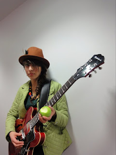
For my front cover, I started off with this photo:


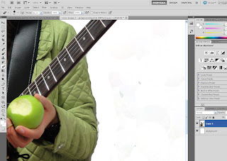
I then opened it up in Photoshop, increased the saturation of the photo to make it more striking, and erased the background using the "background eraser" tool:


Next, I pasted the cut out version onto a new Photoshop document, and stretched the photo so the model appeared taller and to make the photo more in proportion with the page. I then went went over the edges of the image with the "magnetic lasso" tool and the "eraser tool" to make sure I had deleted all of the background, before going over the edges with the "blur" and "smudge" tools to blend the image into the background and smooth all edges:


I then used the "spot healing brush" tool to get rid of any imperfections on the photo, added the masthead and strapline (using fonts from www.dafont.com) and added borders with the "stroke" tool:


I chose the strapline "Your Number One Source For New Music" as if fitted in well with the genre of music magazine that I was making (featuring new up and coming indie bands)and with the title "Underground."

At this point I noticed that the figure's face in the main image and focal point was quite dark, so I followed an online tutorial explaining how to fix it. I then used the "lasso" tool to make a selection of the figure's face and neck, and adjusted the curves of that selection:


I made a final adjustment to the face by using the "dodge" tool on the left eye to whiten it further, making it colour coordinated with the background, and giving the impression that the figure was 'looking' out of the page:


Finally, I added sell-lines along the bottom and right-hand side of the page using a font from www.dafont.com and the "horizontal type" tool on Photoshop, as well as inserting a barcode (which I got off the internet)and price:


Although £3.20 was the average result regarding price, from my first survey, this was based on music magazines with slightly more content; using this price/content ratio, I therefore calculated that my magazine should be priced at £2.20.