
I opened it up in an A3 Photoshop document and placed it over one half of the page. I then made a green border around the entire page using the "stroke" tool, so as to tie in with the green colour scheme of the photo, which gave this result:
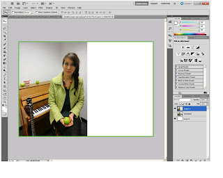
I wasn't happy with it, as the image looked detatched from the rest of the page, so I did some research into double page spreads and found that images on them usually tend to be cut out and layered onto a different background (such as the first image below) or are simply cut around so that they overlap onto the text side of the page (such as in the second image below:
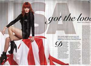
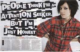
In order to achieve this look myself, I got rid of the page border and used the "magnetic lasso" tool to cut around the edges on the right-hand side of the image:

I then smoothed the edges using the "blur" tool.
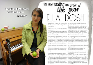
However, the contrast between the grey and white backgrounds still didn't look right, so, repeating an effect that I used for the contents page in my preliminary task, I used the "smudge" tool and the "colour mixer" tool to smudge the top of the grey background around the other half of the page, so that it resembled a kind of border made by a paintbrush. The artistic connotations this held fitted in well with the creative and original nature of the singer featured, which is accentuated by the interview I did (see previous post):

The next step was to insert the article itself; I put it into columns and highlighted the answers in italics so that it would more resemble an interview:

Next, I added headings (using fonts from www.dafont.com) and a pull-quote, the font of which I kept quite simple, as I didn't want the page to appear too busy by using too many different eye-catching fonts. I had initially thought about naming my double page spread artist after one the origins of the model's real name (Ella Doshi), or by using an anagram of it. Unfortunately, neither the anagrams or the origins of the name sounded fitting, so I did some additional research into band and artist names, and finally decided to call my double page spread artist "Ella Doshi" after the model, as I found that many existing artists such as Laura Marling and Kate Nash opt to stick with their own names for their music career:
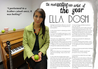
However, the font for the pull-quote didn't seem to tie in with the rest of the page, so I found another font from www.dafont.com which resembled a typewriter font; I didn't want to have too many distracting fonts all on one page, but this one was basic yet looked good. I wanted to create the effect of bits of paper simply having been stuck onto the page so as to tie in with the artistic feel of it, so I "printscreened" the text off www.dafont.com instead of downloading it. This left a white box around the text, which I then pasted onto my double page spread.
Finally, I used the airbrush "eraser" tool to slightly blur the contours of the font, in order to give the impression that it had been intentionally pasted onto the page:
No comments:
Post a Comment