Saturday, December 31, 2011
1. In what way does your product use, develop and challenge forms and conventions of real media products?
I think that now my final product has been changed and improved, it uses and develops forms and conventions of real media products rather than challenging them. Having taken particular inspiration from Q and NME magazines for the aesthetic elements of my magazine, and from NME magazine for the content, I feel that I have achieved a magazine that follows conventions, yet stands out because of its particular emphasis on up-and-coming artists. Primarily, the red, white and black colour scheme of the front cover and contents page helps them to stand out, and takes inspiration from the colour scheme of Q magazine. Furthermore, the fact the I have colour co-ordinated the fonts on the front cover with the cover image, tying in with the pale green of the artist’s coat and the red of her guitar, shows that I have used the conventions of typical magazines such as NME. Another thing that uses and develops forms and conventions of magazines such as NME and Kerrang! is the small article on the contents page about an up-and-coming artist to look out for. Small articles or reviews on contents pages are common in these magazines, and help to make the contents page more interesting whilst keeping the reader's attention. I think my contents page in general is quite similar to the contents pages in Q and NME magazines, as it is streamlined and following a black, red and white colour scheme, as well as following conventions such as having photos with page numbers of some of the artists featured inside. I have also tried to emulate the style of the contents column in NME, by having the artists' names in bold capitals to draw attention to them, and having a smaller short description below. I have developed these forms and conventions by attempting to emulate the original and artistic style of double-page spreads in indie magazines such as NME, through my use of unusual props such as apples, and the smudging of the page border in order to make it look like it has been painted on, to match the quirky nature of the double-page spread artist. This method of adapting the mise-en-scene, fonts and layout to fit in with the genre of the magazine and the double page spread artist is very effective, as the respresentation created by the "arty," creative style of the double page spread ties in well with the fact that I have mentioned "Ella Doshi" is original and creative in the article itself. The green and brown colour scheme of it also connotes nature, which emphasizes the quirky personality of the double page spread artist. The use of several different eye-catching fonts is also conventional, and is very aesthetically pleasing. However, I have tried not to challenge forms and conventions, by ensuring that the size and proportion of all of the fonts is exactly right, so that the page doesn't look cluttered. Overall, I think I have used and developed forms and conventions of real media products well in order to make my own magazine look as conventional and professional as possible.
Changes to double page spread
Here is my double page spread with the new introduction and interview:

I think it looks a lot more professional than before, as it abides by the typical size 8 font used by most magazines. However, as there is still a space at the bottom, I have decided to add the dates that the artist is touring, which appears to be quite common at the bottom of existing double page spreads:

I have also added an album cover, so that readers would be able to recognise the album easily in adverts or shops:

Making the album cover
I initially gave my image a retro look with the help of this tutorial:
http://photoshoptutorials.ws/photoshop-tutorials/photo-effects/retro-colors.html
Firstly, I opened up the photo in Photoshop and then created a new layer. With the new layer selected I then used the Rectangular Marquee tool to create a box around the left hand side of the image. I then chose a red colour from the swatches pallet and used the keyboard shortcut Alt+Backspace to fill the box with red. I then inversed the selection so that the right hand side of the photo was selected, and this time filled it with green. Next, I hid the layer and went back onto the background layer and selected the Match Colour tool. In the image statistics box that came up, I entered the image’s document name as the source, and Layer 1 as the layer. Next, in image options, I increased the fade and decreased the colour intensity of the image.
This was the result:

I then added film grain to my image, with the help of this tutorial:
http://photoshoptutorials.ws/photoshop-tutorials/photo-effects/natural-film-grain.html
Firstly, I opened up my new retro-colours image in Photoshop. I then created a new layer and filled it with 50% grey, and changed the blending mode of the layer to “Overlay”. Next, I right clicked on the layer and selected “Convert to Smart Object”. I then clicked on “Filter” and then on “Add Noise”, the amount of which I adjusted to 400%.I then added a “Gaussian Blur” over the top of this by going on “Filter”, “Blur” and then “Gaussian Blur”. I then adjusted the opacity of the layer so that the grain did not appear too strong. I then added the artist and album name in a font off www.dafont.com.
This is the final image:

Changes made to my contents page
The first changes I made to my contents page was to get rid of the border around the contents column so as to make it look less 'boxy'. Then, taking inspiration from the NME's contents columns, I put all of the band and artist names in bold capitals to make them stand out. I then moved them next to the page numbers and put a short description of the article in smaller letters. I also changed the font, as I wasn't happy with the previous one, and added more articles, as there definitely weren't enough in relation to the cost of the magazine - considering that NME is only £2.20 it tends to be over 60 pages long. I also changed the names of the categories to a red font, and filled the boxes they were in with black.

I then changed the size and positioning of the images and wrote the page numbers in black in the same font as the writing in the contents column, and put them in white boxes. I also got rid of the strip of red along the top, and replaced it with a red and black strip that I made using the 'stroke' tool. This was a lot more aesthetically pleasing and professional-looking than what it looked like originally:

I then added the article I wrote, as well as a the photo to go with it, and the article heading "Look Out For" which I wrote in a font from www.dafont.com. I then added a picture of an arrow to the end of it, which filled up some space and was aesthetically pleasing:

Finally, I added a new subscription box. The only changes I made to the text was to match the font with the rest of the page, make it white and make the website's name shorter, but I filled the box it was in with black and gave it a red border with the stroke tool. This colour scheme made it stand out more and look more conventional. Here is my final contents page:

Article for contents page
Here is an article I've written after researching and finding out that quite a lot of music magazines have small articles (such as reviews or reccomendations of new artists) in their contents pages. I have tried to emulate the writing style and descriptions generally used when talking about the indie/acoustic genre. I also wanted to reference a record label that a similar artist was signed to, as a lot of the time record labels tend to preference a certain genre of music; as Laura Marling is of a similar genre to the artist I have invented here, I chose the record label she was signed to. The "free download" is common in most music magazines, and is a reference to the synergy and convergence in the magazine industry.
The article:
Mon Amie, the stage name for Stephanie Reagen, a songwriter from Twickenham who combines acoustic melodies with raw, haunting vocals. Currently signed to WayOutWest Records, the same record company that brought Laura Marling into the public eye, Mon Amie is hoping to release an E.P in the new year. Songs to listen to are “Spoken” and “You Walked”.
FREE DOWNLOAD OF “CARPET” ON WWW.UDGMAGAZINE.COM
I also included this image of the 'artist':

I got my sister to model for me, and took it with a digital camera. I then adjusted the brightness and exposure on Windows Photo Viewer. The way she is dressed, in particular the skinny jeans, is a style typically associated with indie artists.
Ideas for an album cover
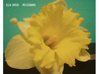
As an addition to my double page spread I think it would be a good idea to add a photo of the album that the artist was releasing. To complement the answers I wrote in the interview, I've decided to create a vintage or retro looking album cover (as this is the style of the artist) featuring some form of flower, to tie in with the fact that she has named a lot of her songs after flowers. Here are a few recce shots that I could use:


Subscribe to:
Posts (Atom)